

Unfortunately there are no closeups of the shorts that are featured with the jersey but in the picture below you can see the new lower case DC logo which is very reminiscent of the old Bullets logo and a nice little touch of stars and stripes on the side piping. I for one, am a big fan of that lower case dc logo and cannot wait until New era makes a nice little navy fitted with the logo, I can see myself rocking that hat all summer.

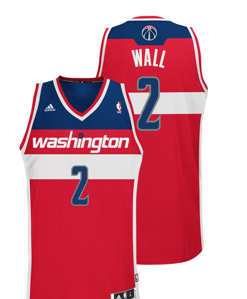
Aside from the crown jewel of this unveiling (The white jersey), the Wizards also released their Red Road Unis which I DO like but I think will need to grow on me a little. I do appreciate the fact that they kept it historic and made the away jersey red, but that is a helll of a lot of red for one jersey haha. Here it is guys, don't let my opinion sway you, a good deal of people so far have liked this jersey even more then the white one. Different strokes for different folks I guess.
Conclusion:
Pros: Very happy with the red, white, and blue palette, as well as the use of striping on the jersey top and stars and stripes on the shorts. Also the lower case DC logo is the shit.
Cons: I personally wish the jersey's palette would have included a brighter more cartoon red, and instead of using navy, which it seems every team in the league is using now, using a royal blue instead. I also wish there was a little more use of stars on the jersey as that made some of the older designs that much cooler.
Overall Rating: Overall, I'll have to give these jerseys an 8 out of 10. I am a big fan of what they TRIED to accomplish, but I still feel like something is missing. Maybe it's because I'm a traditionalist and like things to be as simple and classic as possible, but I still feel the best option for redesign would've been bringing back the 1990's or 1970's bullets jerseys back verbatim with the bullets logo being changed to the new updated wizards one, very similar to what the Jazz did last year.
Will I buy one?: Yea I think it's pretty safe to say I'll pick up the John Wall swingman in white, as long as the price is right. I am probably more interested in getting a pair of the shorts though, and the dc logo hat which I mentioned earlier. Either way, I'm impressed with today's unveiling and look forward to seeing what the court redesign will look like next.
No comments:
Post a Comment